Sherwin Williams Repose Gray: A True Gray
Sherwin Williams Repose Gray is the perfect neutral gray for your home, without any strong undertones. This color is a great one to include in your whole home color scheme!
Our current house is painted with Sherwin Williams Worldly Gray which we love, but like I talked about in our post, it’s for sure greige.
While I really do love the color, it’s not a true gray. And for those of you searching for a true gray, unfortunately, Worldly Gray won’t be for you.
But don’t fret my pet – you’re in luck! Today I’m telling you all about one of my favorite colors from our last house that is most definitely a true gray – SW Repose Gray.
What Undertone Does Repose Gray Have?
This is the most important (and most frequently asked) question when choosing a gray paint; especially if you’re really trying to choose a true gray.
The good news is that Repose Gray has more blue undertones than brown. But even though it has a bit more blue undertones, but it’s not a blue gray. It is still a very warm gray.
That’s why I’m trying to tell you – this color is perfect! And the only thing I would ever say is perfect is me, so that should tell you something (Totally kidding, but hopefully you got a good laugh, yeah?)
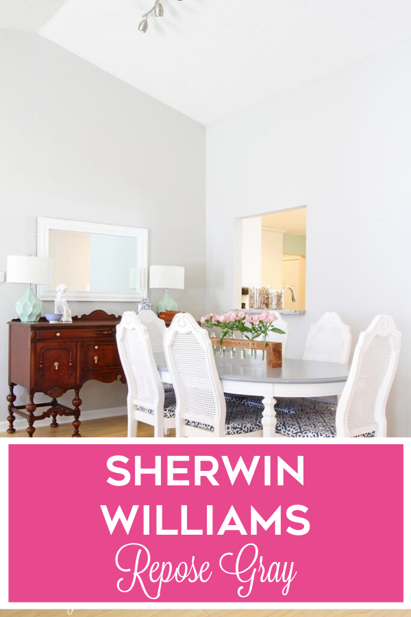
SW Repose Gray In a Real Home
Great Room
We had Repose Gray in 2 homes in our old house and I loved them. First up is our great room.
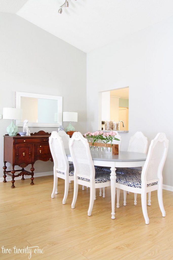
Our floors had a warmer undertone, but we used blue accents on our chairs and wouldn’t ya know, it goes with both?
The wall behind the table with the pass through is an east facing wall which means it gets more natural light in the mornings.
If you look where the two walls meet in the corner, the wall on the left (with the console table and mirror) is slightly darker, but the paint color is still very neutral.
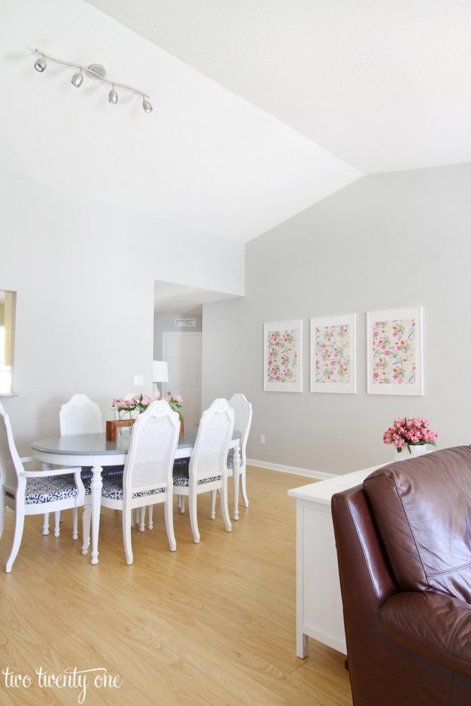
In another view of the opposite wall, you can still see that the table with the pass through is a bit lighter, but yet again, regardless if you have an east facing room or a north facing room (or a south or west for that matter), Repose Gray is still a very neutral colored true gray paint.
If you can’t tell, I really do love Repose Gray.
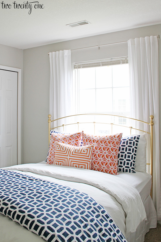
Guest Room
In our guest room, we used Repose Gray again as our color choice and were nothing less than thrilled about the decision. Doesn’t take much to make me happy over here, clearly.
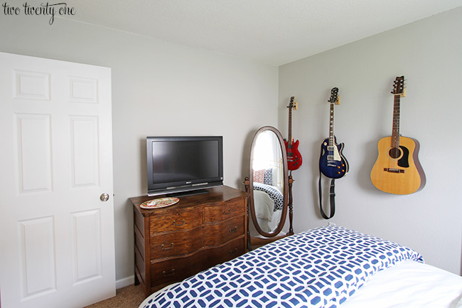
This room only had one window but it brought in a ton of natural light in the whole room which showcased the true color and again, in case you’re wondering – yep. Still a true gray.
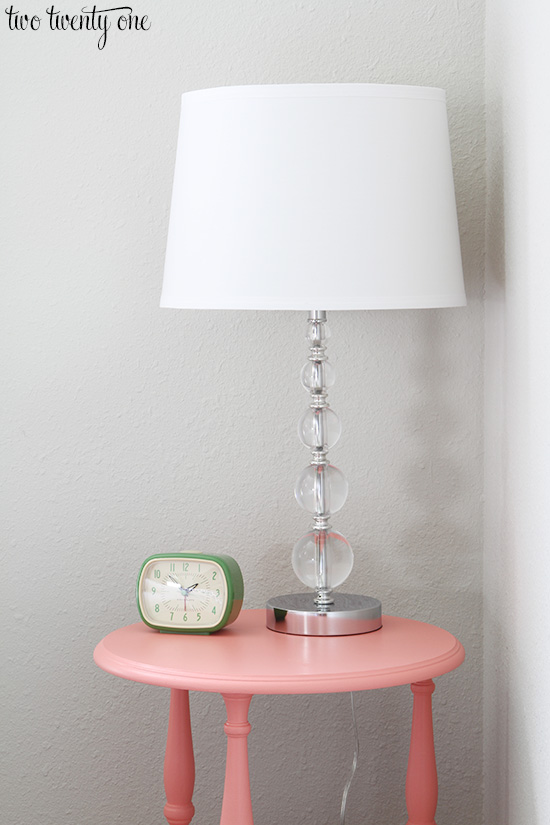
In this closeup shot of the nightstand in this room, you can see that these walls were even a bit textured and it painted just fine. Holla!
I know you’re asking yourself, so let me go ahead and just answer – how does Repose Gray stack up against some of the other really popular gray colors?
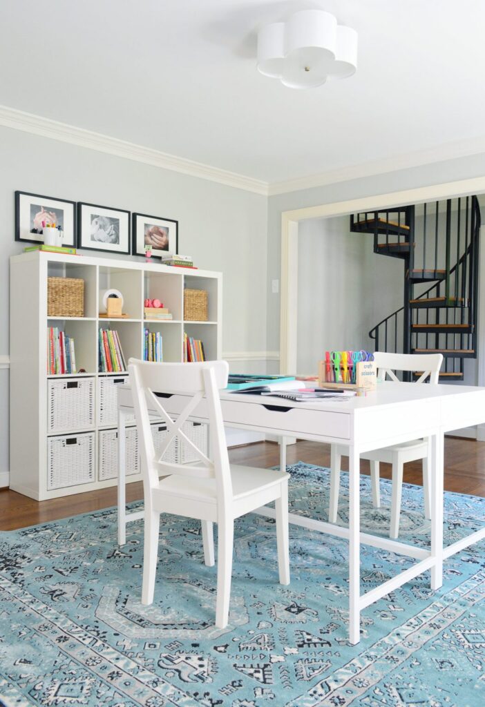
Homework Room
This homework room by Young House Love is bright and serene with Repose Gray on the walls. The trim is Benjamin Moore Simply White.
Repose Gray Popular Color Comparisons
SW Repose Gray vs. SW Light French Gray
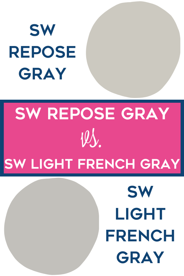
I need to remind you that colors on a computer screen are always, always, always going to look different than they do in person.
I’m begging you to please actually get a sample to test the color out in your space before you just take my word for it. I know I’m trustworthy and all, but still.
Even in this graphic (and on the SW website), Repose Gray looks more like a greige but I can assure you it’s not.
Compared to Light French Gray, it’s a bit darker, but still both are very neutral gray paint color choices.
SW Repose Gray vs. SW Mindful Gray
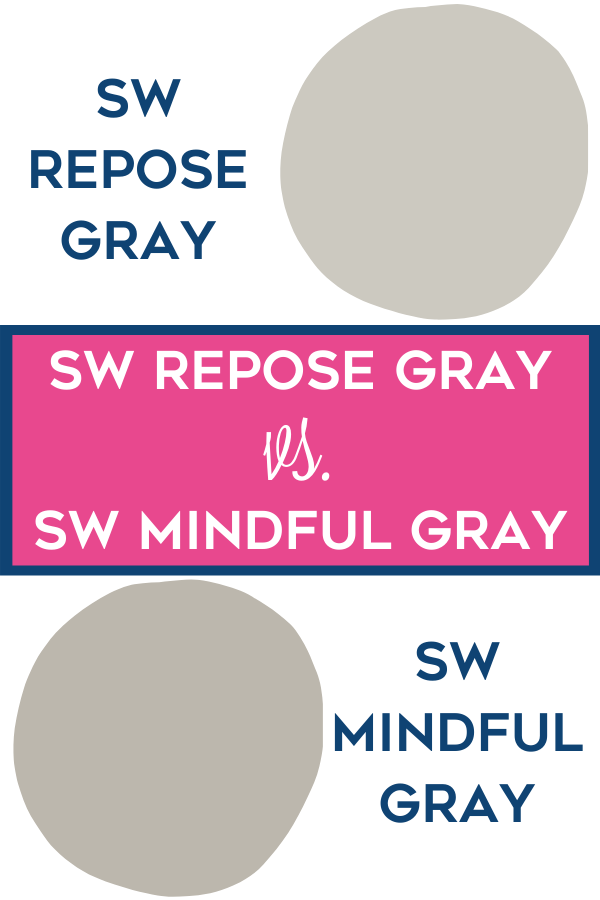
In my humble little opinion, Mindful Gray leans more toward a greige color than grey. If you’re wanting a true grey, I’m going to suggest you stick to SW Repose Gray.
SW Repose Gray vs. BM Revere Pewter
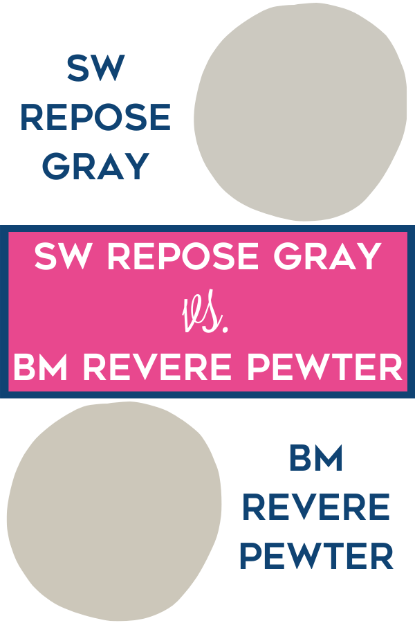
Once again, to reiterate – Benjamin Moore is a beautiful color, but it is most definitely a greige. Which is grey and beige in case you’re new to the paint world.
SW Repose Gray vs. Eider White
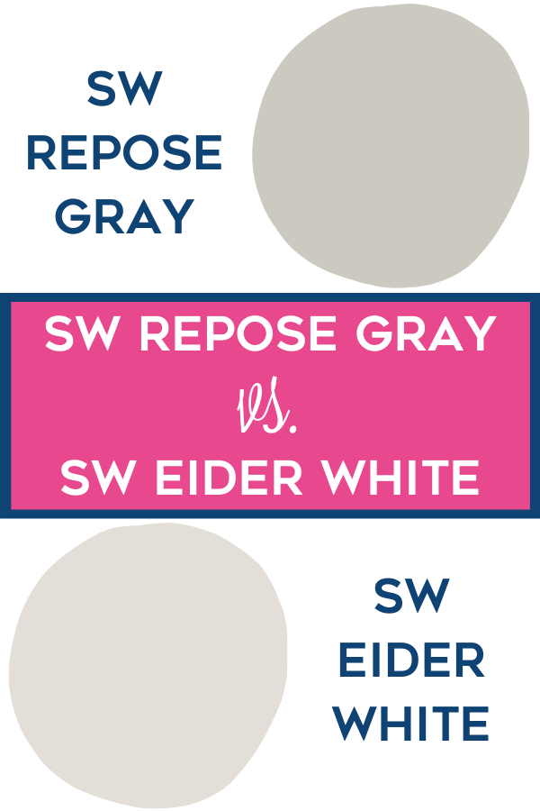
I’m not real sure who’s out here naming paint colors, but Eider White is…..not white. It’s also a neutral gray.
SW Repose Gray vs. Worldly Gray
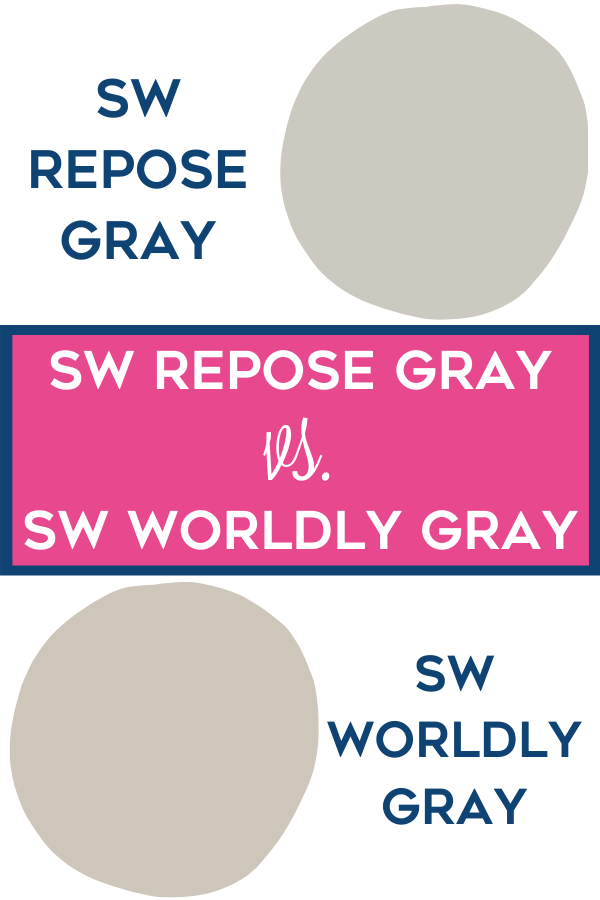
I can hear you guys now.
“If Repose Gray is so great, then why did you put Worldly Gray all in your new house?”
Listen, new house, new paint, right? It’s a chance to start fresh.
But this all goes back to whether or not you have a lot of natural light or not.
What Color Goes with Sherwin Williams Repose Gray?
One of my favorite colors to pair with Repose Gray is Sea Salt.
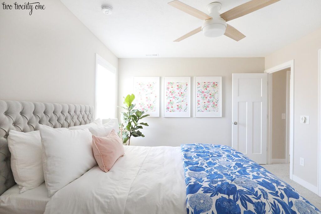
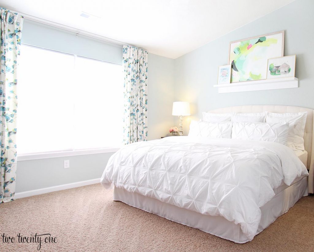
Because it has blue undertones, it pairs really nicely with Sherwin Williams Sea Salt. In our old house we had this in our master and it really flowed well and added just a pop of color.
Our master bedroom had a huge window which means it got a lot of natural light for most of the day and so having the subtle color in here like Sea Salt went well with our Repose Gray great room.
Which is Better – Repose Gray or Revere Pewter?
That’s way more of a question of whether or not you’re looking for a true gray. If you’re looking for a true gray with minimal undertones, you’re absolutely going to want to choose Repose Gray.
If you prefer more of a greige color that can look more beige in certain rooms, by all means go with Revere Pewter.
What Color Trim with Repose Gray?
Now, I’m not one for painted trim although it does seem to be trending as of late.
I will say that I think Repose Gray up against crisp, white trim is a look that can fit into any decor style you have. Doesn’t matter if you swing more modern, more traditional or have a combination of any two styles.
If you’re looking for specific trim colors that go well with Repose Gray, try either Sherwin Williams Extra White or even Sherwin Williams Pure White.
I really think this color could be used throughout your entire house. If you’re not wanting it on the wall, have your go at painting kitchen cabinets Repose Gray! I’ve seen this in several kitchens in the land o’ Pinterest and it’s gorgeous!
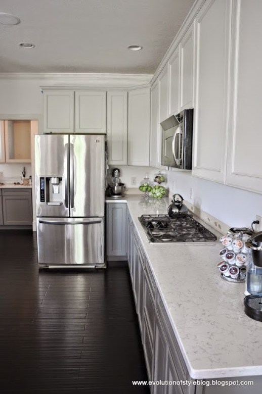
This kitchen from Evolution of Style Blog was one of my favorites I found. This was a client kitchen of hers and the upper cabinets are Repose Gray and the lowers are Gauntlet Gray.
I love the pairing of the lighter colored gray cabinets with the super dark wood floors.
Regardless of where you put it, Sherwin Williams Repose gray is a color that is sure not to disappoint!