Master Bedroom Paint Mock Ups
I’ve said it before, I’m terrible when it comes to decision making.
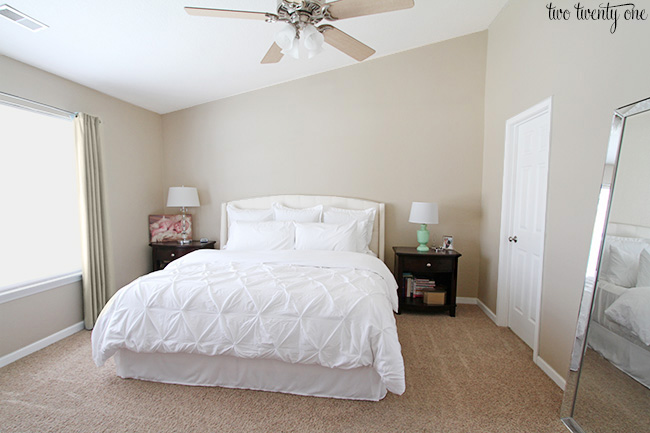
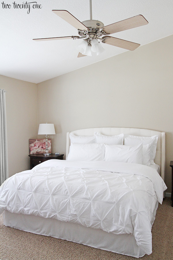
When it came to picking out the right wall color for our master bedroom I felt like I needed to take it to the next level. So I asked my awesome friend, Erin, to help me out and “paint” my bedroom in Photoshop.
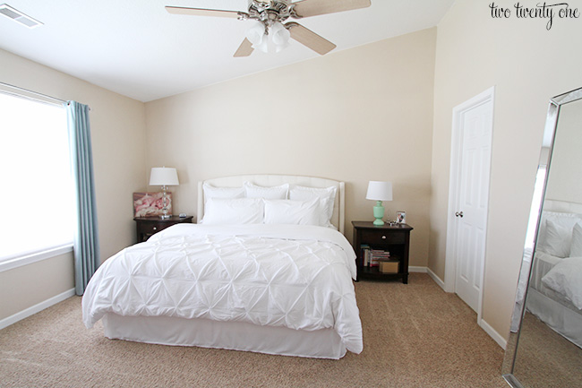
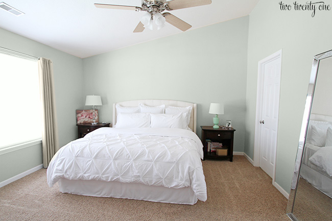
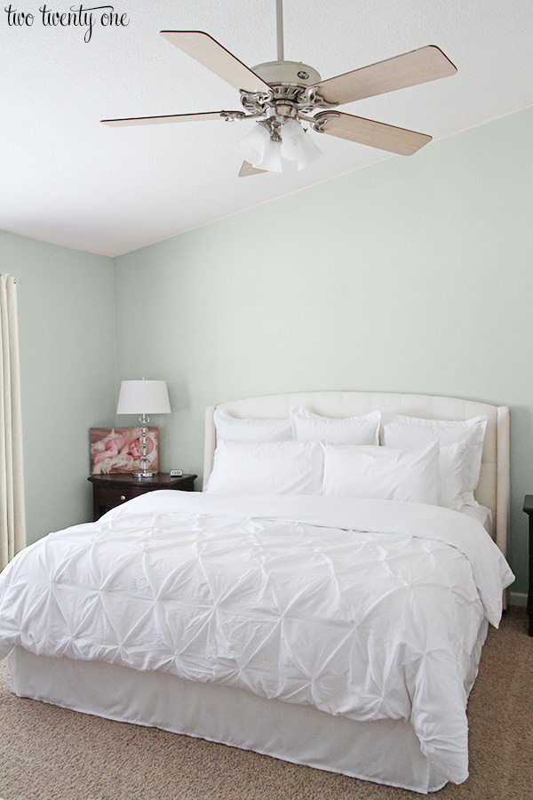
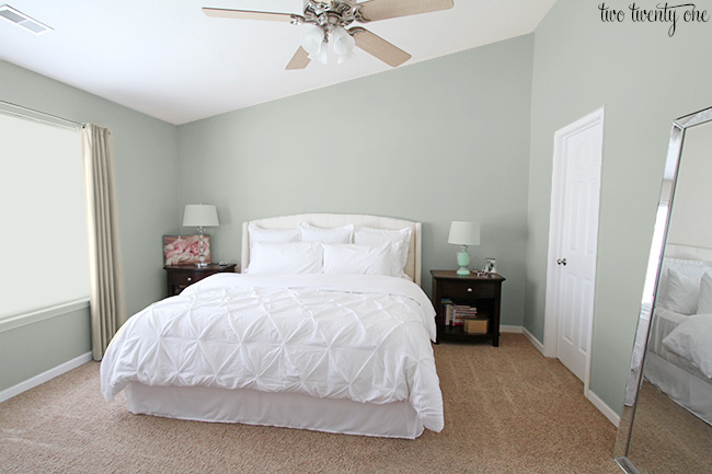
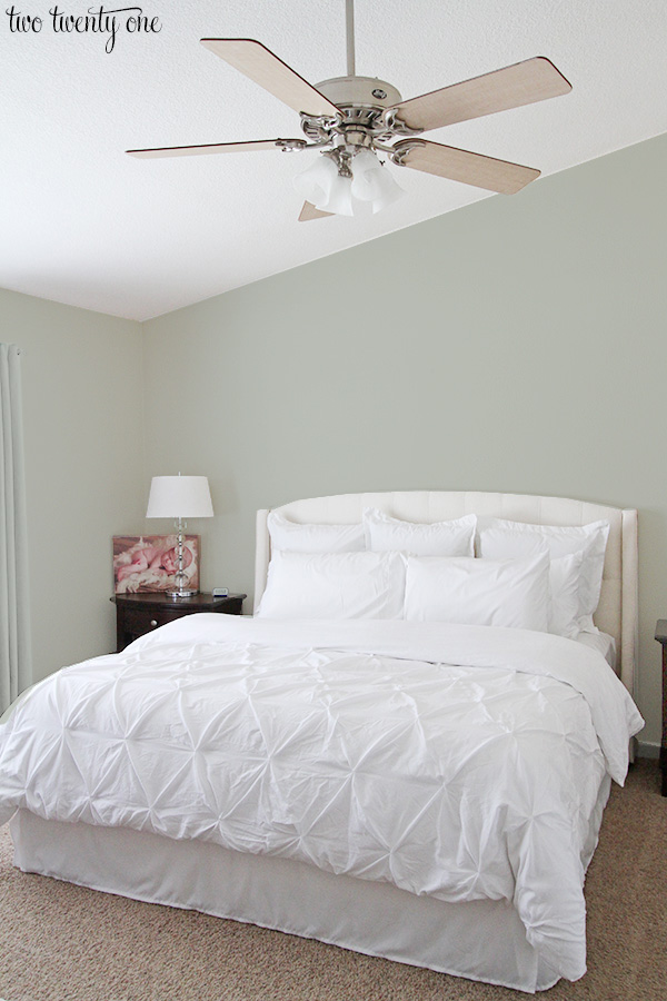
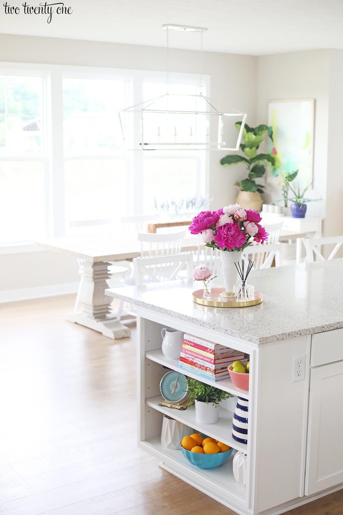
As a reminder, here’s what the bedroom looks like now.
And here are the paint swatches I painted on the wall.
Sea Salt SW 6204
Comfort Gray SW 6205
Agreeable Gray SW 7029
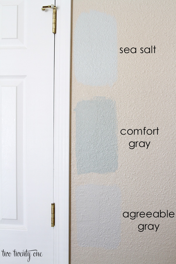
Let’s start with agreeable gray.
I’m not digging it. Too bland. Too much beige. Hard pass.
Here’s Sea Salt.
I like how bright and airy it feels. I also think it looks good with the headboard, bedding, and our carpet.
If I do go with Sea Salt, I feel like I’m going to have to add some more life to the space with accessories and/or punchier curtains.
And lastly we have Comfort Gray. It’s one shade darker than Sea Salt.
I’m kind of torn between Sea Salt and Comfort Gray.
Comfort Gray is obviously darker, but I feel like that it still keeps the room bright enough.
So, which one do you like the best? Cast your vote below!


I think the Comfort Gray makes your woodwork stand out as well. You seem to have a lot of natural light coming in but I wonder what the colors look like on a gloomier day.
We have Comfort Gray in our master bedroom and love it! It is very light and calming for a bedroom.
Comfort grey has more saturation and is very calming. It is still neutral enough that you can bring in punch of colors whenever you need to. Our bedroom is more of a blue gray and I just love how calming it is!
I just used Sea Salt in my living room and Comfort Gray in our office. The Comfort Gray has a little less blue undertones and does seem a little more soothing. Sea Salt has a brighter undertone with more blue in it. I love them both but I think the Comfort Gray looks really nice in your bedroom. It’s still light enough but just seems to go better with your colors.
I like comfort grey best too.. Both Sea salt and comfort grey read green in the photo… Do you see that.?
Hard choice! I LOVE Sea Salt and am planning to use it to paint my dining room, but I think the Comfort Gray is perfect for your room. Not too light, not too dark, and goes great with your headboard and bedding!
Comfort Gray!
Sea salt is my preference, light and airy and you can add color in other places. You can also add some gray in the throw pillows and / or curtains.
Oh cute! I don’t know which color I like the best. The color you currently have is nice too.
I really wanted to tell you as I was voting for Comfort Gray, the sea salt, makes your whites and off-whites give off a yellow tone- and its very blech! Comfort Gray allows all of your brights, to be bright and allow you to have a calm new pallette to work with. Good luck!
Sea Salt!!!!!
Comfort Gray. Now go get your paint on girl! Yesssss!
Sea Salt all the way!
Have you ever thought of moving the bed to in front of the window? I’m not sure of the rest of your room layout but it might look nicer than the bed being on the angle wall. I’ve seen some great pics on Pinterest.
I’m not a fan of beds in front of windows. Plus, I like walking into a room and having the bed face the door. And if I didn’t have the bed on the angled wall I don’t know what I’d put on the wall to fill up all that space, if that makes sense. Especially because that wall faces the door.
These are the best photoshop renderings of pain color that I’ve seen! Usually you can tell that it’s fake, but these look super realistic. Erin has skillz.
PS I like the comfort gray!